This graphic design draft is just that, a draft. Completing this project helped me realize what I wanted and what I don’t want within my logo. I like the overall aesthetic of the image but I definitely have some things that I need to tweak.
The design process for this one was a “go with the flow, and follow my gut.” I took elements that i liked (all courtesy of my adobe stock pro plan) and put them into something that was pleasing to the eye.
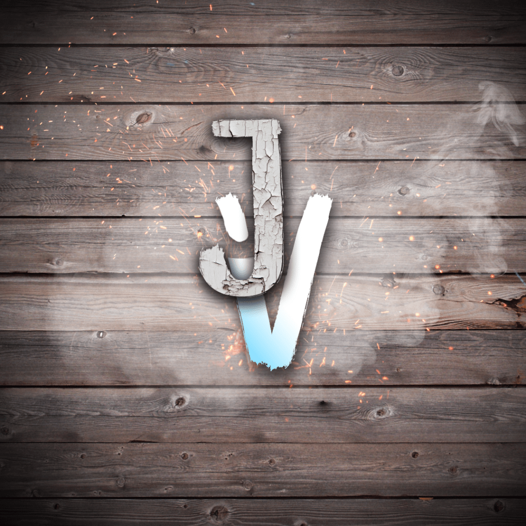
The meaning behind the J and the V is the initials of my ‘brand’ JamesVlogss. As i progress through working with this draft I hope to come to a complete logo that I am happy with and something I can actually utilize on my account.
The chipped wood that I have textured on to the J represents the trials and tribulations that I have had to go through on my journey to growing a successful vlog account.
The V has a light blue to white gradient. The light blue is somewhat of a “Staple” color on my page, as my old logo was predominately that color. One thing you may notice is that the V is incomplete on the left leg. That was intentional and is supposed to represent a goal that I am trying to reach. As the lower part of the V grows up to attach itself to the upper part, that is analogous to me trying to attain the goal of that verified badge on instagram.
The smoke is na ode to the ever-present cloud that hangs over my head when trying to compete with more serious Vloggers such as the Paul brothers.
Overall, the logo has a very deep and personal relationship with me and my brand, and this is just the first step to bringing it to fruition.
*All images either personally made or courtesy of Adobe Stock
*Techniques used in the creation of this logo such as; Clipping masks, Blend mode, 3d extrusions, adjustment layers and more can all be accessed on youtube.

hey
LikeLike