Draft Logo Project

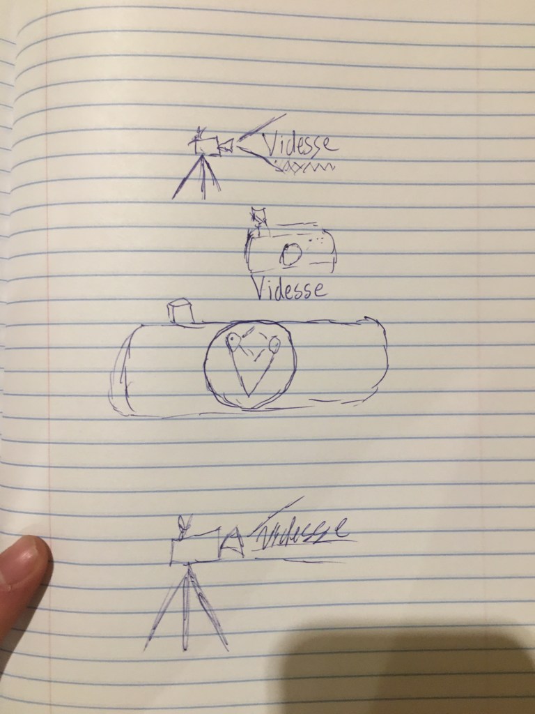
This is my logo for a video production company called videsse. Videsse specializes in commercial video production – hence the camera in the logo.

This logo was difficult to make because I struggle with Illustrator. The program is a little confusing to me so it takes me a little while to get the hang of it.

The camera on the left was made by just finding a camera that I thought looked cool online and then mimicking it in Illustrator. I used a combo of shapes and lines to create the look of the camera.

The two gray lines coming off of it are there to make it look as if it is shooting video. They also serve to help the viewer understand what is creating the shadow for the letters of Videsse.

I chose a cursive font because I thought it looked cool. But also I like how all the letters are connected. i think it makes the viewing of the image more fluid.

As this is just a draft I will have some upgrades to do. Currently I do not know how I will be altering it for the final version but i’m sure that classmate feedback will help me pinpoint what needs to be changed.

I forgot to mention the background. For the background I used a radial gradient from light gray too white to give it a semi three dimensional look. Pairing that with the slight under-shadow that the camera graphic gives off creates an interesting dynamic throughout the whole piece.

What Videsse is is it’s the name of the company I created for a business plan competition. It was a cool experience but I think it would ad to the legitimacy if I had a logo to go along with it. So that is what I am doing!

Graphic Design Final

This is my Final Logo! First of all lets start of with the changes I chose to make. I change the texture on the J to steel. I like the shiny look of it and I think it gives an all around stronger vibe.

Next you will notice the tire marks in the background. Honestly I just did that because it looked cool. But upon further reflection I like what they can represent. It shows that I have been walked on but JamesVlogss still rises above. It embraces all that the JamesVlogss brand has come to mean to me.

Making this logo was not an easy task to undergo. First I had to sit and think about what I wanted it too look like. All in all I think I spent 3.5 hours on the total project. It may not seem like a long time but that is three uninterrupted hours; for me that is impressive.

I went into a lot of detail about the full meaning in my previous post but I will reiterate a little but here. “The meaning behind the J and the V is the initials of my ‘brand’ JamesVlogss. The V has a light blue to white gradient. The light blue is somewhat of a “Staple” color on my page, as my old logo was predominately that color. One thing you may notice is that the V is incomplete on the left leg. That was intentional and is supposed to represent a goal that I am trying to reach.” For a more in depth look at what it means you can look at my previous post.

All in all this was a great assignment and I am glad we did it. I designed a logo that i am proud of and can’t wait to start using it to brand my account.

One thing I wanted to add is that I had to produce my own brush for the tire marks. It was not to in depth of a process but it was something I thought was cool.

*Once again all images are courtesy of Adobe Stock”

Graphic Design Draft

This graphic design draft is just that, a draft. Completing this project helped me realize what I wanted and what I don’t want within my logo. I like the overall aesthetic of the image but I definitely have some things that I need to tweak.

The design process for this one was a “go with the flow, and follow my gut.” I took elements that i liked (all courtesy of my adobe stock pro plan) and put them into something that was pleasing to the eye.

The meaning behind the J and the V is the initials of my ‘brand’ JamesVlogss. As i progress through working with this draft I hope to come to a complete logo that I am happy with and something I can actually utilize on my account.

The chipped wood that I have textured on to the J represents the trials and tribulations that I have had to go through on my journey to growing a successful vlog account.

The V has a light blue to white gradient. The light blue is somewhat of a “Staple” color on my page, as my old logo was predominately that color. One thing you may notice is that the V is incomplete on the left leg. That was intentional and is supposed to represent a goal that I am trying to reach. As the lower part of the V grows up to attach itself to the upper part, that is analogous to me trying to attain the goal of that verified badge on instagram.

The smoke is na ode to the ever-present cloud that hangs over my head when trying to compete with more serious Vloggers such as the Paul brothers.

Overall, the logo has a very deep and personal relationship with me and my brand, and this is just the first step to bringing it to fruition.

*All images either personally made or courtesy of Adobe Stock

*Techniques used in the creation of this logo such as; Clipping masks, Blend mode, 3d extrusions, adjustment layers and more can all be accessed on youtube.

Image Collection (3 Images)

All images are courtesy of Adobe Stock of which I have a pro subscription.

I have full usage to these images, I am unaware of how to provide documentation of license but I will find out and post here ASAP.

Course Topic

I am going to be focusing this course on creating content for my filmmaking instagram account Jamesvlogss. I have had this Instagram account since early 2018 and this course gives me an excellent opportunity to expand.

The collection of materials for this will not be hard. I have been recording video, taking pictures, and working with the whole adobe suit for about four years now. I have amassed a lot of original content and i’m always going out and collecting more.

For the logo project I will be designing a logo for JamesVlogss. I am very excited for this because I have wanted to do this for a long time but have never gotten around to it. I look forward to the challenge of creating a image that is visually appealing, while also conveying the necessary information about me.

For the video project I have a lot of Ideas. I base my instagram account around the creation of videos so I am looking forward to completing this project. I have a couple concepts floating around as to what I could do, but I think the one I like the most would be a “BTS” (Behind the scenes) of the making of a vlog.

As for the audio unit, I would tell the story of how I got into filmmaking and then how that blossomed into the creation of Jamesvlogss. I expect the audio unit will be one of the more entertaining ones because I am excited to talk about that story.

Here is a link to my Instagram page. https://www.instagram.com/jamesvlogss/

As you can see the thumbnails for my videos are very disorganized, so another goal for this semester would be to create more of a uniform look on my account. The top profile picture would be replaced with the logo I create, and I would post the video I make onto my Instagram account.

The Instagram account linked below is a big inspiration for me.

https://www.instagram.com/kold/

His name is Sam Kolder and he is a travel vlogger. I have made several videos that mimic his style (that I have yet to post) but ideally my Instagram feed would start to mirror his.

This is an example of a vlog on youtube

https://www.youtube.com/watch?v=-zSljKwq5SA

As you can see it is 24 minutes, the maximum time for a Instagram video is 1 minute. So I have the challenge of condensing and finding a way to tell a story in the short amount of time allotted. Although it is hard, I absolutely love doing and I look forward to expanding it more in the coming months.

Coming into this class I have a lot of experience with the Adobe Creative Suit, so my goals for the class are to expand what I know and work on creating content at an extremely high level of quality.

Thank you for reading my Blog Post!